Created on Thursday, 18 November 2010 08:53
Published on Thursday, 18 November 2010 08:53
Hits: 7920


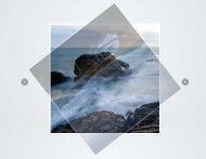
The Piecemaker, a 3D Flash image rotator gallery in the purest sense of the word. It’s Open Source, so feel free to download it, use it in any project you like, learn from it, modify it and improve it if you can. We’d love to see what you do with it. Of course that’s no binding condition, but we’d love to showcase your work on the official Piecemaker website.
Requeriments:Flash
homepage
http://www.modularweb.net/piecemaker/How to embed The Piecemaker STEP 1. Copy the packages „com“ and „caurina“ from the folder to your classes directory. It works without that, but only if you always move these packages along with the FLA file. If you‘re not familiar with working with classes, check the tutorial at Adobe Livedocs. STEP 2. Open the file „piecemaker.fla“ and try to publish it to check, if the classes are referenced correctly. STEP 3. The actual gallery is nothing more than the empty MovieClip on the „gallery“ layer. It has the base class „com.modularweb.imageGalleries.Piecemaker“, which holds all the code. To copy the gallery into your own project, you just need to copy this MovieClip as well as all the elements from the library to your project. STEP 4. Three basic properties of the gallery are assigned on the „actions“ layer. The code from this layer has to be copied to your project, too. These properties are xmlSource, cssSource and imageSource, which hold the paths to the XML file, the CSS file and the folder containing the images to be loaded. Please note that if you embed the gallery to your project, these paths need to be relative to the location of your project. Settings in the XML file The XML file has a node named <Settings>, which surprisingly holds the settings to be made. This node includes the following properties: 1. imageWidth - the width of the images to be loaded 2. imageHeight - the height of the images to be loaded 3. segments - number of segments, in which the images will be sliced 4. tweenTime - number of seconds for each element to be turned 5. tweenDelay - number of seconds from one element starting to turn to the next element starting 6. tweenType - type of transition from Caurina‘s Tweener class. Find all possible transition types and more information about Tweener in the official documentation. 7. zDistance - to which extend are the cubes moved on z axis when being tweened. Negative values bring the cube closer to the camera, positive values take it further away. A good range is roughly between -200 and 700. 8. expand - to which etxend are the cubes moved away from each other when tweening 9. innerColor - color of the sides of the elements in hex values (e.g. 0x000000 for black) 10. textBackground - color of the description text background in hex values (e.g. 0xFF0000 for red) 11. shadowDarkness - to which extend are the sides shadowed, when the elements are tweening and the sided move towards the background. 100 is black, 0 is no darkening. 12. textDistance - distance of the info text to the borders of its background 13. autoplay - number of seconds to the next image, when autoplay is on. Set 0, if you don‘t want autoplay. Adding images from the XML file Images can also be added, changes or deleted within the XML file. Supported file types are JPG, GIF and PNG. The images are loaded from the folder, which is specified in the FLA. Without changing this means images are loaded from a folder named „images“, which is in the same directory is the gallery. To add an image, you‘ll need to create a new Image node in the XML file or simply duplicate one of the existing Image nodes. Such a node looks something like that: <Image Filename=“image1.jpg“> <Text> <headline>Description Text</headline> <break>Ӂ</break> <paragraph>Here is some text</paragraph> <break>Ӂ</break> <inline>Here is some more text and aӁ</inline> <a href=“url“ target=“_blank“>hyperlink</a> </Text> </Image> The appearance in terms of font-family, font-style, color, etc. of the tags used within the <Text> node can be defined within the CSS file, which is also specified in the FLA. Without changes this would be the file piecemakerCSS.css within the same directory of the gallery. As whitespaces in the beginning and end of tags are being ignored, you‘ll need to replace those with the Ӂ, which is in turn replaced by a space within the gallery. Changing the look of buttons, etc. in the .fla file The look of elements such as the buttons for „next image“, „previous image“ or the „autoplay“ MovieClip can be changed directly within the FLA file. Find all elements accordingly named within the folder piecemaker graphics. How they can be changed should be clear as soon as you‘ll see how the look in default.
 piecemaker.zip piecemaker.zip
|
600 kB |
Parent Category: Images | Gallery
Category: Others
Search
Latest News
Animated CSS3 Photo Stack
Animated CSS3 photo stack is use all kinds of fancy effects to transition between a set of images. The effects are implemented purely using CSS3, which means that they run smoothly on modern browsers...
Read More... Threesixty-slider

Threesixty-slider is a jQuery 360 image slider plugin.
The plugin is full customizable with number of options provided. The plugin have the power to display images in any angle 360 degrees. This feature...
Read More... D3.js a Data-Driven Documents
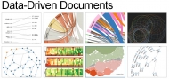
D3.js is a JavaScript library for manipulating documents based on data. D3 helps you bring data to life using HTML, SVG and CSS. D3’s emphasis on web standards gives you the full capabilities of modern...
Read More... Three.js A awesome 3D Engine
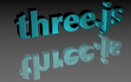
Three.js is a library that makes WebGL - 3D in the browser - very easy. While a simple cube in raw WebGL would turn out hundreds of lines of Javascript and shader code, a Three.js equivalent is only...
Read More... MilkChart

To transform a table of data into a chart, simply create a MilkChart object of the chart type you wish passing in the table id and an object containing options for the chart.
Read More... - 1
Who's Online
We have 33 guests and no members online
Latest Users
- Alexandertak
- Carpsyday
- acrotolla
- clarezn1
- tosyacantiect
Comments
I'm having problems with the quantity of banners that piecemaker are showing, it just let me put 10 banners, do you can help me please?
gustavo_sjc
RSS feed for comments to this post